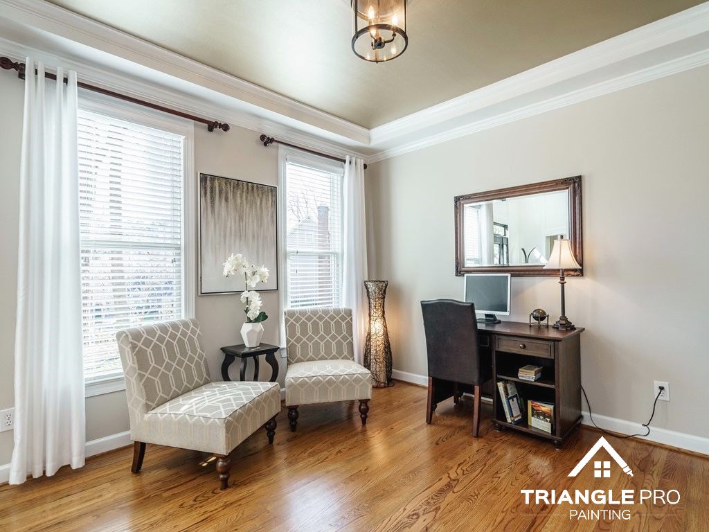
Choosing the right neutral paint color for your home near Downtown Raleigh can feel harder than it should. What looks perfect on a tiny paint chip can feel completely different once it covers an entire room. Too cool, and the space may feel flat or sterile. Too warm, and it can look dated or overly yellow.
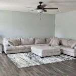
That is why neutral paint colors remain such a smart choice. They create a timeless backdrop, work with almost any decorating style, and make it easier to update furniture, flooring, and accents over time. They also tend to appeal to a broader range of tastes, which matters if you want your home to feel current now and marketable later.
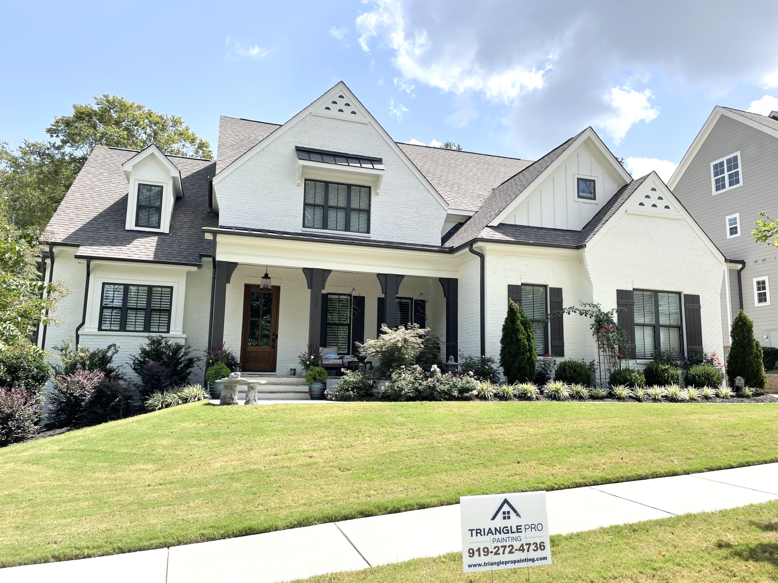
For homes near Downtown Raleigh, neutral colors are especially effective. The area’s mix of historic charm, modern renovations, natural light, and varied architectural styles makes flexible, balanced colors the best fit. Whether you live in a bungalow, townhouse, condo, or updated older home, the right neutral can make your space feel brighter, calmer, and more polished.
Below are some of the best neutral paint colors to consider, along with tips on where they work best and how to use them successfully.
Accessible Beige: Warm, Comfortable, and Easy to Live With
Sherwin-Williams Accessible Beige is a soft greige that leans warmer than many of today’s popular grays. It has enough depth to create warmth without feeling heavy, which makes it a strong choice for Raleigh homes with natural wood, brick accents, or warmer flooring tones.
Why it works
Accessible Beige feels welcoming and grounded. It works especially well in homes that get plenty of natural sunlight, where it reads as a warm neutral instead of a flat beige.
Best uses
This color shines in living rooms, bedrooms, hallways, and open-concept main areas. It can also work well in kitchens if you want a softer alternative to stark white.
Design tip
Pair it with warm white trim instead of icy bright white. That keeps the room feeling cohesive and relaxed.
Agreeable Gray: The Crowd-Pleasing Neutral
Agreeable Gray remains one of the most popular paint colors for a reason. It blends gray and beige in a way that feels current, flexible, and highly livable. For many homes near Downtown Raleigh, it offers the perfect middle ground between warm and cool.
Why it works
It adapts well to changing light, which makes it a practical option for homes with mixed exposures or open layouts. It also tends to photograph beautifully, which is helpful if resale is on your mind.
Best uses
Agreeable Gray works well in living rooms, bedrooms, kitchens, hallways, and even exterior trim or siding in the right setting.
Design tip
Use crisp white trim and darker accents like navy, charcoal, or black for a clean, modern look.
Revere Pewter: A Classic Greige with Depth
Benjamin Moore Revere Pewter has long been a favorite for homeowners who want a neutral with a little more richness. It is warm, versatile, and slightly moodier than some lighter greiges.
Why it works
This color adds sophistication without making a room feel dark. It performs especially well in brighter homes where natural light can bring out its soft gray-beige balance.
Best uses
It works beautifully in living rooms, dining rooms, bedrooms, kitchens, and even on cabinetry.
Design tip
Use soft white trim and darker accent colors for contrast. It also pairs well with warm wood finishes and brushed metal hardware.
Alabaster: The Soft White That Never Feels Harsh
Sherwin-Williams Alabaster is one of the best whites for homeowners who want brightness without the sharpness of a pure white. It has a creamy softness that helps rooms feel fresh but still comfortable.
Why it works
Near Downtown Raleigh, where many homes feature strong daylight, Alabaster keeps spaces feeling open without turning cold or sterile.
Best uses
It works beautifully on walls, trim, cabinetry, and ceilings. It is especially good for bedrooms, kitchens, bathrooms, and smaller spaces that need a lift.
Design tip
If you want an all-white look, use different sheens on walls, trim, and ceilings to add subtle dimension.
Worldly Gray: A More Sophisticated Greige
Worldly Gray is a refined neutral that offers more body than many lighter grays. It can read as a warm gray or greige depending on your lighting and surrounding finishes.
Why it works
It gives rooms a calm, tailored appearance and works well in homes with mixed materials like stone, hardwood, and brushed metal.
Best uses
Worldly Gray is a strong option for main living spaces, bedrooms, bathrooms, and kitchens where you want a slightly deeper neutral.
Design tip
Because it can shift depending on lighting, sample it on multiple walls before committing.
Repose Gray: Soft, Balanced, and Versatile
Repose Gray is ideal for homeowners who want a true gray with a softer edge. It has subtle undertones that keep it from feeling flat, but it still reads as a clean, modern neutral.
Why it works
It feels airy in well-lit rooms and more cocooning in darker spaces, making it a flexible choice for many Downtown Raleigh homes.
Best uses
It works well in bedrooms, offices, living rooms, nurseries, and kitchens.
Design tip
Repose Gray looks best when paired with crisp trim and thoughtful accent colors like muted green, navy, or black.
Edgecomb Gray: A Lighter, Softer Greige
Benjamin Moore Edgecomb Gray is a great choice if you want something subtle and inviting. It is lighter than many greiges, but still has enough warmth to avoid looking washed out.
Why it works
This color creates a smooth, flowing look throughout a home, which is especially useful in smaller homes or open layouts where you want continuity.
Best uses
Bedrooms, hallways, family rooms, and kitchens all benefit from its soft warmth.
Design tip
It pairs especially well with white trim, warm woods, and natural textures like woven shades or linen drapery.
Dover White: A Creamy Neutral with Character
Dover White is warmer and creamier than many off-whites, making it a strong option for homes that lean traditional or farmhouse in style.
Why it works
It adds softness and charm, especially in rooms that need warmth. In the right home, it can make walls feel bright without looking stark.
Best uses
It fits well in living rooms, bedrooms, kitchens, and other spaces where a cozy look matters more than a crisp modern feel.
Design tip
Be cautious in very sunny rooms, since strong natural light can bring out more of its yellow undertones.
Balboa Mist: Light, Elegant, and Adaptable
Balboa Mist is a pale greige that feels soft and refined. It sits between gray and beige, which makes it useful for homeowners who want a neutral that does not feel too warm or too cool.
Why it works
It responds beautifully to Raleigh’s natural light and can create a fresh, elevated look without overwhelming a space.
Best uses
It is ideal for living rooms, dining rooms, bedrooms, and open-concept spaces where you want a clean but approachable look.
Design tip
Use soft white trim and darker accent pieces to keep the room from feeling too subtle.
Gray Owl: A Cool Light Gray with a Fresh Feel
Gray Owl is one of the better choices if you prefer a cooler gray. It has a soft, airy quality that can make interiors feel bright and modern.
Why it works
It fits homes with contemporary finishes, marble surfaces, or cooler lighting. It can also work well in renovated Downtown Raleigh homes that lean more urban or transitional in style.
Best uses
It performs well in bedrooms, bathrooms, living spaces, and kitchens with cooler materials or stainless steel finishes.
Design tip
Because it can lean blue or green in certain lighting, always test it before using it throughout the house.
Swiss Coffee: Creamy, Soft, and Collected
Swiss Coffee is a warm off-white that works beautifully in homes that want softness over stark contrast. It feels classic, comfortable, and especially appealing in relaxed interiors.
Why it works
It suits a wide range of home styles, from modern farmhouse to traditional to transitional. In Raleigh homes with lots of texture and warm details, it creates a balanced, polished backdrop.
Best uses
It works on walls, cabinetry, trim, and even exteriors in the right setting.
Design tip
Pair it with warm woods, earthy accents, and darker contrast colors like charcoal or navy.
How to Choose the Right Neutral for Your Raleigh Home
Even the best paint color can fail if it does not match your space. Before choosing one of these neutrals, keep a few things in mind:
Consider your natural light
Homes near Downtown Raleigh often get strong daylight, especially in renovated spaces with larger windows. That light can make colors appear brighter, warmer, or cooler than expected.
Look at your fixed finishes
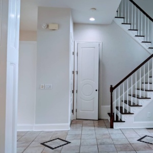
Flooring, countertops, fireplace brick, tile, and cabinetry all affect how paint will look. Your wall color should work with those elements, not fight them.
Test before you commit
Paint large sample areas on multiple walls and check them in morning, afternoon, and evening light. This step can save you from an expensive mistake.
Think about the mood of the room
Some neutrals feel soft and calm, while others feel crisp and modern. Choose a color that supports how you want the room to feel, not just what is trending.
Final Thoughts
Neutral paint colors are popular for a reason. They make homes feel more open, more polished, and easier to style. For homes near Downtown Raleigh, they also offer the flexibility needed to work with a wide variety of architectural details, lighting conditions, and design preferences.
The key is not just picking a popular neutral, but choosing the one that works best with your home’s natural light, materials, and overall character. A color that looks beautiful in one house may feel completely different in another.
If you want professional guidance, the team at Triangle Pro Painting can help you narrow down the best neutral paint colors for your home and apply them with the level of care that makes the final result look clean, cohesive, and long-lasting. The right neutral does more than cover a wall—it helps your entire home feel more finished, inviting, and timeless.