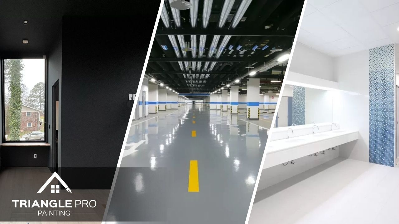


The colors inside and outside your commercial space shape how customers, clients, employees, and visitors feel before a conversation even begins. A clean, professional color palette can make your business look more trustworthy, organized, modern, and welcoming. On the other hand, outdated, overly dark, or inconsistent colors can make the space feel less polished.
Choosing the right commercial paint colors is not just about personal preference. Offices, retail spaces, medical buildings, restaurants, and service-based businesses all need colors that support their brand, improve the customer experience, and create the right first impression. Whether you are refreshing a single room or planning a full commercial repaint, working with experienced painting services in Raleigh, NC can help you choose colors that fit your business and your space.
Why Commercial Paint Colors Matter
Commercial spaces need to communicate professionalism quickly. When someone walks into your office or storefront, they notice the condition of the walls, the brightness of the room, the cleanliness of the trim, and how the colors work with lighting, flooring, furniture, and signage.
Paint color can influence how large or small a space feels. It can make a reception area feel calm, a retail space feel energetic, or an office feel more focused. The right color choices also help reinforce your brand identity without overwhelming the room.
A professional commercial painting project should consider more than the wall color alone. Trim, ceilings, accent walls, doors, exterior surfaces, and high-traffic areas all work together to create the final impression.

1. Soft White for a Clean and Timeless Look
Soft white is one of the safest and most professional commercial paint colors. It creates a clean background that works well in offices, retail stores, medical spaces, salons, studios, and service-based businesses.
Unlike harsh bright white, soft white feels warmer and more comfortable. It reflects light well, making rooms appear larger and brighter. This can be especially useful in smaller offices, waiting rooms, hallways, and retail spaces where natural light is limited.
Soft white also pairs well with almost any brand color. If your business uses bold signage, artwork, furniture, or product displays, a soft white wall color allows those features to stand out without competing for attention.
2. Warm Gray for a Modern Professional Feel
Warm gray is a popular choice for commercial interiors because it feels modern, neutral, and polished. It works well in offices, conference rooms, showrooms, retail spaces, and professional service environments.
Gray can create a serious and refined look without feeling too cold when the undertone is chosen carefully. Warm gray has a slight beige or taupe influence, which makes it softer than cooler industrial grays.
This color is especially helpful when a business wants a professional background that feels updated but not trendy. It pairs well with black, white, wood tones, metal finishes, and many brand colors. For interior spaces that need a clean but grounded look, warm gray is often a strong option for interior painting.
3. Greige for Balance and Flexibility
Greige, a blend of gray and beige, is a flexible commercial paint color that works well in spaces where you want warmth and professionalism at the same time. It is less stark than gray and more updated than traditional beige.
This color is a good fit for offices, lobbies, waiting areas, consulting rooms, and retail environments where comfort matters. It gives the space a neutral, approachable feel while still looking professional.
Greige also works well with different flooring materials, including wood, tile, carpet, and polished concrete. Because it adapts to both warm and cool design elements, it can be useful for businesses that are updating gradually rather than replacing everything at once.
4. Navy Blue for Trust and Authority

Navy blue is a strong commercial color for businesses that want to communicate trust, stability, and confidence. It works especially well as an accent wall color in offices, law firms, financial spaces, consulting businesses, and professional service environments.
Using navy on every wall may make a room feel too dark, especially in smaller spaces. However, when used strategically, it can create a powerful first impression. A navy accent wall behind a reception desk, in a conference room, or near branded signage can make the space feel intentional and high-end.
Navy also pairs well with soft white, warm gray, brass, wood, and clean black accents. It gives businesses a professional appearance without feeling plain or overly neutral.
5. Deep Green for Calm and Sophistication
Deep green has become a strong choice for businesses that want a calm, natural, and sophisticated look. It works well in wellness spaces, design studios, restaurants, boutique retail shops, offices, and hospitality settings.
This color can make a commercial interior feel grounded and memorable. Like navy, deep green works best when used thoughtfully. It can be used on an accent wall, in a waiting area, behind shelving, or around a branded feature.
Deep green pairs beautifully with warm neutrals, wood tones, cream, black, and natural textures. It creates a sense of depth without feeling too aggressive, making it a strong option for businesses that want something more distinctive than gray or beige.
6. Light Blue for a Calm and Welcoming Space
Light blue can help create a calm and comfortable environment. It is often used in healthcare offices, dental practices, wellness spaces, consulting rooms, and offices where a relaxed atmosphere is important.
The key is choosing a soft, muted blue rather than a bright or overly saturated shade. A gentle blue can make a room feel open and peaceful while still looking professional.
Light blue works well with white trim, light gray, natural wood, and simple modern décor. It is a good option for businesses that want visitors to feel at ease as soon as they enter the space.
7. Charcoal for a Bold, High-End Impression
Charcoal is a strong choice when used in the right setting. It can make a commercial space feel modern, dramatic, and upscale. Restaurants, showrooms, salons, creative studios, retail shops, and office feature walls can all benefit from carefully placed charcoal paint.
Because charcoal is dark, it should be balanced with lighter walls, strong lighting, and clean trim. Too much charcoal can make a space feel heavy, but a controlled use of the color can make the room look polished and intentional.
Charcoal is especially effective for accent walls, exterior doors, trim details, or display areas. It pairs well with white, warm wood, metal fixtures, and bold brand colors.
8. Beige and Taupe for Warm Professional Spaces
Beige and taupe remain useful commercial paint colors when chosen in updated, modern tones. Older beige shades can feel dated, but warm taupe, mushroom, or soft sand colors can make a business space feel welcoming and professional.
These colors work well in offices, waiting rooms, medical spaces, rental offices, and service businesses where the goal is comfort and neutrality. They are less sharp than white and less cool than gray, making them a good fit for spaces that need warmth.
Taupe and beige also hide minor marks better than bright white, which can be useful in high-traffic commercial interiors.
9. Exterior Colors for a Strong First Impression
Your exterior paint color is just as important as your interior color palette. Before a customer enters your business, the outside of the building already creates an impression. Faded, mismatched, or outdated exterior colors can make the property look neglected.
For many commercial buildings, strong exterior choices include soft white, warm gray, charcoal, beige, taupe, navy accents, or black trim. These colors can help the building look clean, professional, and easy to identify from the street.
If your building exterior is faded, peeling, or no longer aligned with your brand, professional exterior painting can improve curb appeal while protecting the surface from weather exposure.

How to Choose the Right Commercial Paint Color
The best commercial paint color depends on your business type, brand personality, lighting, layout, and customer expectations. A law office may need a different color strategy than a boutique retail store. A medical space may need calming colors, while a showroom may benefit from stronger contrast.
Before choosing a color, consider:
- How customers should feel when they enter
- Whether the space needs to look calm, modern, energetic, or high-end
- How the color works with your logo and brand materials
- How much natural light the space receives
- Whether the room is high-traffic or low-traffic
- How the color will look on both walls and trim
- Whether an accent wall would support the design
Testing paint samples before committing is always helpful. Colors can look different depending on lighting, flooring, furniture, and time of day.
Why Professional Commercial Painting Matters
Commercial painting requires more planning than a simple residential repaint. Business owners need clean lines, durable finishes, minimal disruption, and a schedule that works around daily operations.
Professional painters can help with surface preparation, product selection, color placement, and finish choices. They can also recommend coatings that hold up better in high-traffic areas, customer-facing spaces, and exterior surfaces exposed to weather.
Working with a team like Triangle Pro Painting helps ensure your commercial repaint is completed with the right preparation, products, and attention to detail. From small office updates to larger business properties, the right painting team can help your space look polished and professional.
Conclusion
The best commercial paint colors create more than a fresh look. They help shape the first impression people have of your business. Soft white, warm gray, greige, navy, deep green, light blue, charcoal, beige, and taupe can all work well when they match the purpose of the space and the message your brand wants to send.
A professional color palette can make your office, retail store, or commercial building feel cleaner, more modern, and more trustworthy. Whether you want a calm customer experience, a bold accent wall, or a refreshed exterior, the right paint colors can support your business image in a simple but powerful way.
If your commercial space is ready for a new look, Triangle Pro Painting can help you choose colors that match your brand and apply a durable, professional finish. Their team provides interior, exterior, and commercial painting services designed to create a polished first impression from the moment customers see your property.